Seema Hussain's Art
Sunday, June 2, 2013
Perspective Drawing of Paper bags
The composition in creating these paper bags was to draw the outline of the paper bags meaning to draw the form of the paper bag. Once I drew the form of the paper bag I shaded in the paper bag using values of light and dark. The way I decided where lighter shades and darker shades were to be shaded in was by using the light source provided and that was a key tool in deciding where to put the greater value. I also added in a shadow where as you start from the paper bag its dark but as your move farther away the shadow gets lighter.
Perspective Drawing of Initials
To creating this perspective drawing of my initials I used a two-point perspective of my initials. In My composition for each letter I drew a straight horizontal line and drew the vanishing points. I made a vertical line below the horizontal line but also leaving space between both lines. Then I connected the vertical line with the horizontal line making it look like a triangle. After that I drew two more vertical lines, one on each side of the original vertical line and then I connected those new lines with the horizontal lines making a box inside of the triangle. Next I erased all the guidelines that created the triangle shape leaving me with the box shape. Then I transformed the boxes to make them look like box shaped letters of my initials. For the background I decided to stick with the basic pattern that I like so I made diagonal lines and colored them in. I chose a minty green that I thought looked good with the background colors and wouldn't fade into the background colors. I also used black to color in the parts of the letter where the green would be darker which also created value within my initials.
Perspective Drawing of Me ! ! !
 |
| Composition Drawing |
Above is my composition sketch in my notebook. I used those measurements to help create the picture of me below. To help get a better drawing of me I was provided a mirror to look at myself and draw with charcoal. When looking at myself with the mirror I had to decide on what expression I was going to make and so I decided to do a slight smile. Idea was that when I make my expression was to get every distinct feature and to showcase it through my perspective drawing. With the charcoal I used contour lines to shape my hair and to show the texture of my hair. The use of value is shown throughout the whole picture. On the left hand side you can see the light source and where everything is very light shaded and black/grayish. The right hand side where every thing is very black and dark shaded.
Escher Inspired Perspective Drawing
This entire perspective drawing was inspired by the artist, M. C. Escher. One thing you notice about Escher drawing are his symmetry, how objects reflect off of each other or just how some things are flipped around.Composition was a quick sketch in my sketchbook of how I was picturing the drawing in my head. To creating this two-dimensional I drew a straight horizontal line. Next I had marked two dots at the end of the horizon line and these are known as the vanishing points. Then I drew a vertical line below the horizontal line and connected the vertical line with the horizontal line. After that I drew two more vertical lines, one on each side of the first drawn vertical line and then I connected those lines with the horizontal lines. Once I had erased the guide lines it created my boxes for the building. I decided to draw the two-dimensional building floating on a cloud. If you notice its raining under the umbrella and one thing I took from Escher is that I flipped the raindrops on one side where the rain drops are pointing down. There were changes of value in the drawing as you can see in the umbrella. If you notice in the cloud the edges are dark but as you get closer to the building it gets lighter.
Plaster Sculpture
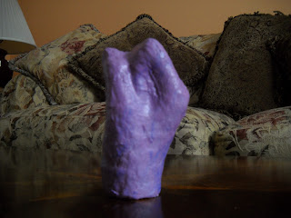
The whole composition for my plaster sculpture was simple. I had to first decide on what hand expression did I want my peer's hand to form. Therefore, I decided to incorporate sign language in my project and by doing so I had chosen the letter "S" in sign language to be the hand expression. Always before you put plaster strips on skin is to cover that area of skin with petroleum jelly otherwise known as Vaseline. Reason being is because when the plaster is all dry and ready to be removed from the person it won't pull off any hair or get stuck on the skin and it will easily smooth off painlessly. Once my peer's entire hand was covered in petroleum jelly I dipped the plaster strips into the bowl of water, squeezed the excess water and then placed onto my peer's hand. Key to making sure the strips aren't too wet is that when you dip the plaster strip into the water to lightly press on the strip and get rid of the excess water. When you place the strip onto the skin you must immediately rub the plaster strip with your index finger. After the whole entire hand is covered in plaster strips and there are no holes or gaps always put a second layer on top to be sure. Once you have the second layer done now comes being patient and letting the plaster fully dry. The thing to letting the plaster dry is that there is no exact time of when the plaster will dry. However, to make the plaster dry quicker you can gently wave your plastered hand back and forth and plus it keeps your blood circulating. Once the plaster is entirely dry take a scissor and carefully cut a slit in the plaster at the end of the wrist. Take a hold of the persons hand and let the person gently pull their hand out of the plaster. Go back and cover the slit opening with plaster and let that dry, should only take a few minutes. The fun thing now is that I got to paint my plaster sculpture purple and add some blue and I painted the words "LOVE" on the fingers.
 |
| symbolizes the letter "S" |
 |
| side view of the hand |
 |
| "LOVE" |
Ceramics Project
Description of the project: Borderline is made of waves and the inside is designed with the letter "S" which stands for my name.
Medium: White Clay
Size: length 9", width 7 1/2", height 4"
The design element that was stressed during the construction of my project was form. The technique that had been used was slab and slump mold. The inspiration for the form that I had decided to work with was the letter "S" which I had chosen because I wanted my name to be somehow incorporated so I decided to use the first letter in my name. My form serves a function in a way where I keep it on my desk and I put my bobby pins and hairbands and my Ipod in there. I could even put popcorn in there and eat while watching a movie or TV if I wanted to! If I had the option to do the project all over again and start from scratch I would love to and this time I'd change the change the shape of the bowl and keep the "S" but also use Islamic designs to surround the "S". Reason being I would use Islamic designs is to bring my culture into my artwork. If anything I can take away from this ceramic project is that I learned as an artist you need to have patience because the project takes a while to do and there are a lot of tools involved in creating this ceramic bowl.
Medium: White Clay
Size: length 9", width 7 1/2", height 4"
 |
| Before |
 |
| After |
Acrylic Landscape Painting
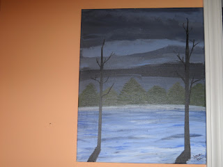
 The composition that I used was images from geographical magazines and images on Google that I had printed out.Therefore, I was able to use those images and write down key notes about what aspects and details from each of those images that I could use for my acrylic painting. The way I organized my painting was by using those key notes that I had wrote down about each picture and then drawing out a quick sketch of how I planned on putting everything together. Atmospheric perspective is where the effect of the atmosphere (background color) has on the appearance of the object(s) as it is viewed from the distance. I gradually shaded in the colors of the objects closer to the horizon thus creating an atmospheric perspective. Creating the light source I had to have an idea of where the light was coming from and so because of that I decided the light source would be coming from the left hand side. For my color scheme I decided to go with Analogous and stick with the blues. The brushes I used were Nicole Acrylic Brushes; sizes: 3/4", 5/8", 1/2", 2", 4", 8". Types of brush strokes used: Smooth strokes- horizontal and vertical strokes I used for the solid surfaces such as the background and used with a round brush. Parallel strokes- stroking upwards with the tip of the brush, using quick wrist flicks. Used with a flat brush that is portrayed in the two trees. Key to creating value is by using tint and shaded colors. To create tint add white to the color and to create shades add black to the color.
 |
| Images I was inspired by to create my beautiful painting. |
 |
| Quick Sketch of how I was imagining my painting to be |
Subscribe to:
Posts (Atom)


